
Munchkin News
|October 15, 2019
Babies At Heart: The Re-branding of Munchkin, Inc.
By DIANA BARNES “db”
Chief Brand Officer (CBO) & Creative Director (CCO)
Munchkin, Inc.
The sacred ground of a rebrand is what I imagine the experience of giving birth for the second time to be like. You know the process and the pain that will ensue and although confident that the end will produce something wonderful and beautiful, you are still nervous and perhaps a bit scared.
A rebrand is a daunting and dazzling responsibility for any creative. At its core, design is always about solving a puzzle. Answering questions. First, this means you have to know how to ask them and, maybe the most difficult, be open to hearing the answers. Our 30 years as a leading baby brand means we have an innate sense of responsibility to take our consumers with us in our evolution to something that has more meaning and purpose.
At a higher level, we asked ourselves what does it mean to be a baby company today? What do we want our legacy to be? Are we ready to stand behind the position we are taking on educating parents and children about protecting animals and their ethos? What efforts are we truly willing to take to make a positive impact on sustainability?
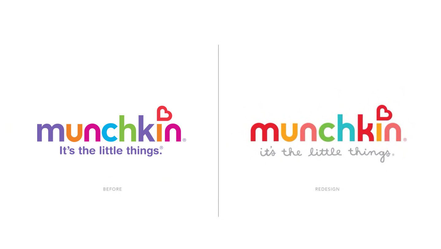
On a purely tactical level, we had to ensure that our refreshed mark and packaging had global resonance. Our past logo had served us well for 15 years, but the redesign needed to feel like our present and future consumer.
What are the common threads that our consumers want from us? What do we need to tell them? To answer these questions all you need is love and ceaseless research—as it is the breadcrumb trail every company must follow for a successful rebrand. The consumers will always tell you what they need and what they find ridiculous.
At Munchkin, we often say “we were born in LA, but we are growing up around the world.” Because we have retailers and loyal consumers worldwide, we reached out to the leading marketing research firm, IPSOS, to conduct a massive, best practices global insight study across China, Europe and North America that included shop-alongs followed by “in-home friendship triads.” Additionally, our Brand Design and Marketing teams sat down with our key retailers for direct conversations with buyers for their input.
Among all of the data collected around our packaging, the overwhelming feedback on our branding was that the Munchkin customer knows us by our “colors.” They also told us that we have more work to do before our sideways heart icon can stand alone without the aid of the Munchkin name, which is a future branding goal.
One of the most inspiring things about my job (and there are so many!) is leading our global Brand Design team. Any verbal or visual articulation of our brand is done in house by this motley, award-winning crew of over 30 visionaries. Working with them to bring this new design to life was a careful and cohesive journey. Our intent was never to entirely abandon our old mark (an age old, knee jerk reaction many companies make), but to lean into the brand equity the research proved we owned.
Our designers began by linking our heart icon more to the logotype through color and typography refinement. No baby should be around a sharp edge, so we removed them from the existing letterforms, using the perfect circle as our guide in each form. The K is the most obvious change which became rounded, more like a hug into soft arms. A safe place for a baby (or a heart) to land. We infused the color red to the M and, most significantly, the K making the tie to our red sideways heart more thoughtful and prominent. We updated our color palette to be more current, gender neutral and vibrant.
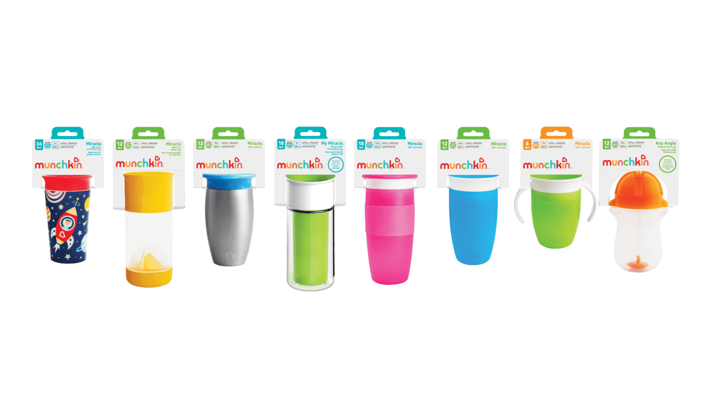
Our timing could not have been more organic or more advantageous. The packaging design engineers are knee deep in the Herculean process of converting all of our 500+ SKUS to non-PVC packaging. We seized the opportunity to fold our rebrand into these sustainability redesigns. 2020 also happens to be our 30th anniversary which is definitely reason for a celebratory refresh! Our CEO has curated a large and eclectic street art collection at our LA headquarters, so it was natural to ask the renowned Chairman Ting to create four 30th Anniversary murals that captured our key products, CSR efforts and even our well-loved company rescue dog, Poppy!
So far, the roll out has been fully embraced by our shareholders, retailers and customers. I believe our General Manager of our EMEA region offered the perfect summation of our branding result,
—”Continually evolving – a hand out to the past, capturing the present with direction to the future.”